Conducting data analysis using data tables, pivot tables and other common functions
1.2 Conducting Data Analysis
1.2.1 Data Tables
What are Data Tables
Data tables are used in Excel to display a range of outputs given a range of different inputs. They are commonly used in financial modeling and analysis to assess a range of different possibilities for a company, given uncertainty about what will happen in the future.
How to Create Excel Data Tables
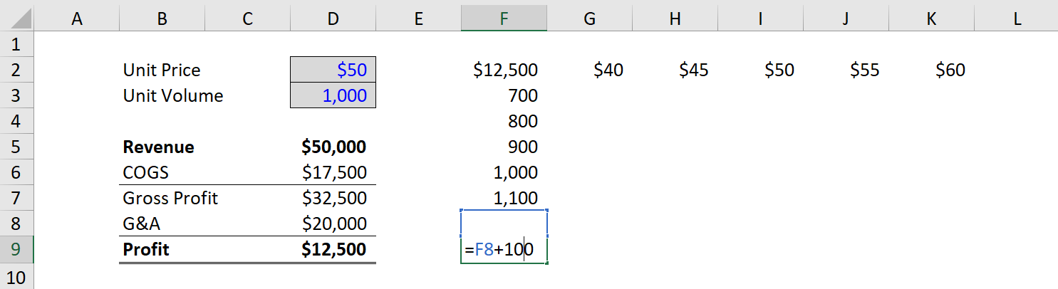
Below is a step-by-step guide on how to create an Excel data table. In the example, we will look at how much operating profit a company will generate based on different product prices and different sales volumes. We have built a simple model that assumes one variable cost (cost of goods sold), and one fixed cost (general and administrative expenses).
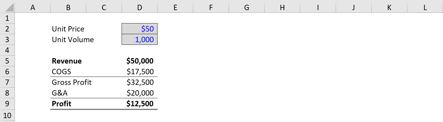
Step 1: Create a Model
The first step when creating data tables is to have a model in place. We’ve made a simple model that includes two key assumptions: unit price and unit volume. From there, we have a simple income statement that includes revenue, COGS, G&A, and operating profit (EBIT).
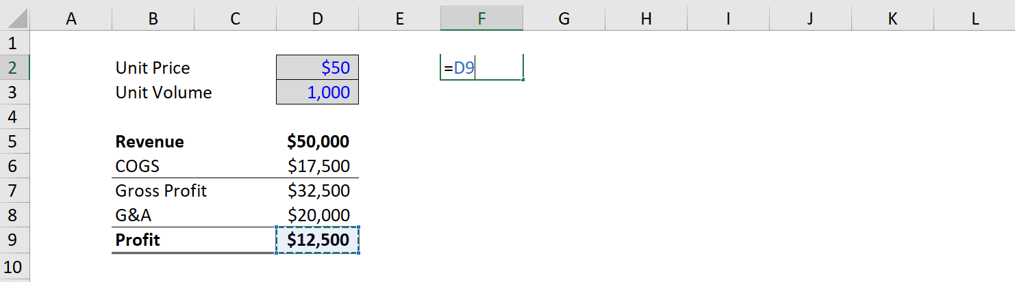
Step 2: Link the Output
Since profit is what we want to use as the output, we simply take an empty cell in the model and link it to net income at the start of the data table (the top left corner).
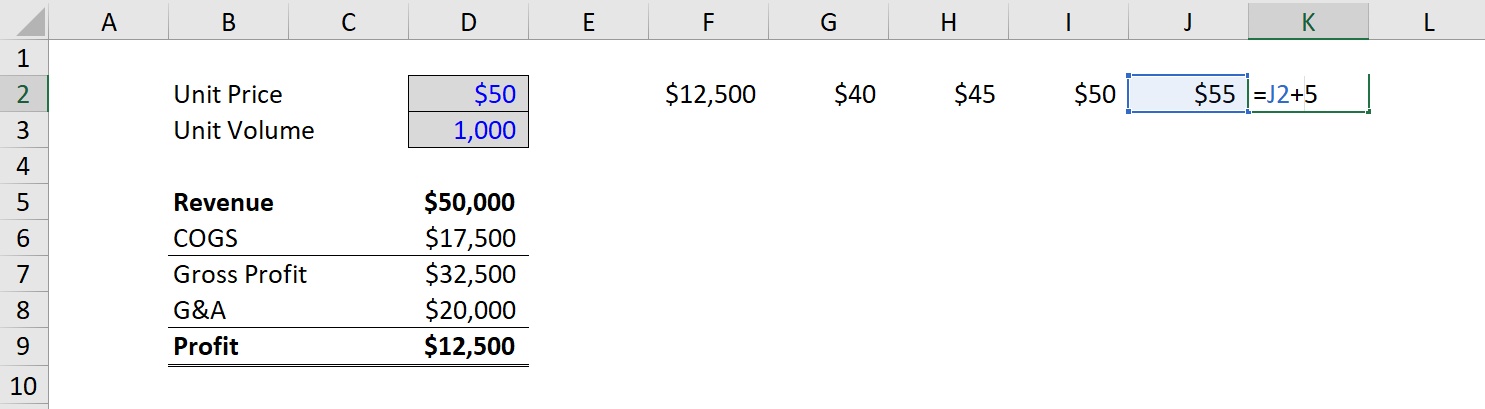
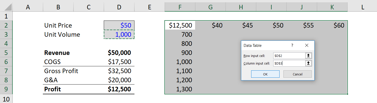
Step 3: Enter the Input Values
Once net income is linked, we need to enter the different values we want to test for unit prices and unit volumes. To do it, we manually enter the values across the top and left sides of the table. In this case, we will enter unit prices from $40 to $60 and volumes from 700 to 1,300.
Step 4: Highlight the Cells and Access the Data Tables Function
With the structure of the table complete, the next step is to highlight all the cells with data that will be used to form the table, and then access the Excel data tables function under the Data ribbon and What-If analysis.
The keyboard shortcut on Windows is Alt, A, W, T.
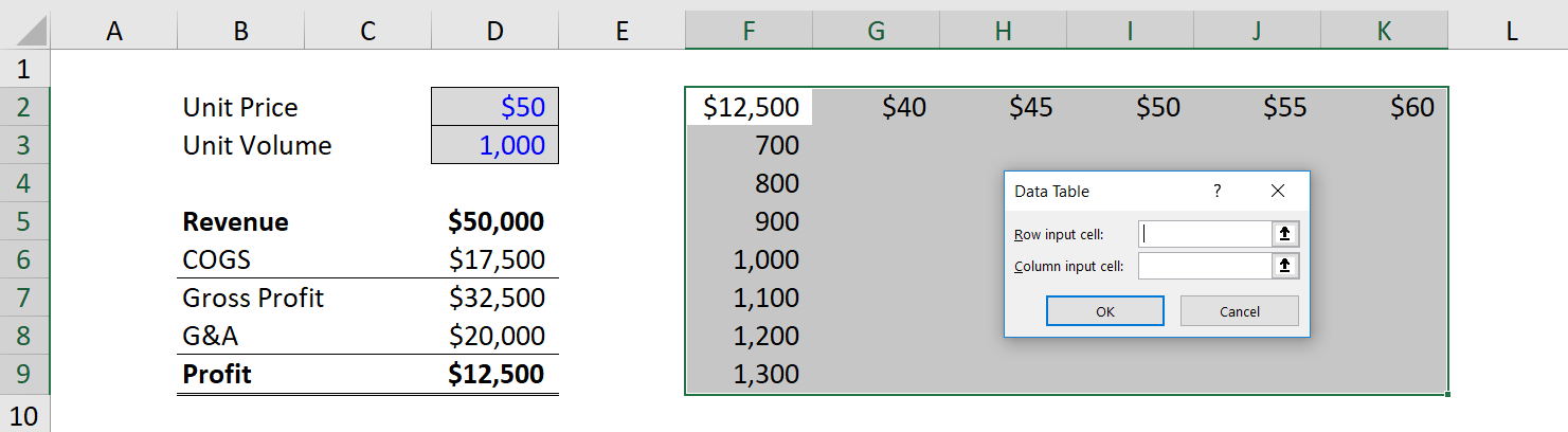
Step 5: Link the Input Values
This can be one of the trickiest steps when setting up data tables. Financial analysts often aren’t sure where the Row Input Cell goes and where the Column Input Cell goes. The easiest way to think about it that the Row refers to the assumptions across the top of the table, and the Column refers to the assumptions across the left of the table. So, link each of them to the hard-coded assumptions that drive the model.
Step 6: Format the Data Table Output
Once the table is linked, it can be helpful to do some basic formatting so that the data table is easier to read. This includes adding borders and labels, so users can easily see the information contained in the analysis.
Goal Seek
What if you want to know how many books you need to sell for the highest price, to obtain a total profit of exactly $4700? You can use Excel’s Goal Seek feature to find the answer.
1. On the Data tab, in the Forecast group, click What-If Analysis.

2. Click Goal Seek.

The Goal Seek dialog box appears.
3. Select cell D10.
4. Click in the ‘To value’ box and type 4700.
5. Click in the ‘By changing cell’ box and select cell C4.
6. Click OK.

Result. You need to sell 90% of the books for the highest price to obtain a total profit of exactly $4700.

PIVOT TABLES
What is a Pivot Table in Excel?
A pivot table allows you to organize, sort, manage and analyze large data sets in a dynamic way. Pivot tables are one of Excel’s most powerful data analysis tools, used extensively by financial analysts around the world. In a pivot table, Excel essentially runs a database behind the scenes, allowing you to easily manipulate large amounts of information.
How to Use a Pivot Table in Excel
Below is a step by step guide of how to insert a pivot table in Excel:
1. Organize the data
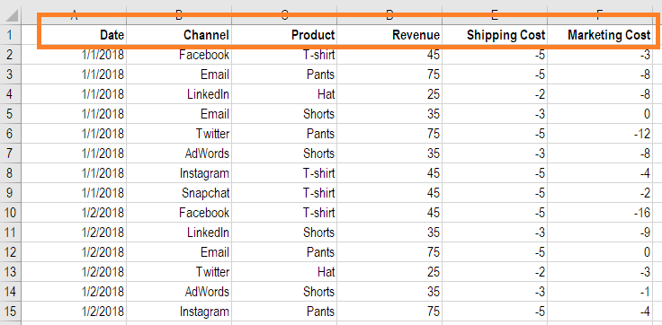
The first step is to ensure you have well-organized data that can easily be turned into a dynamic table. This means ensuring that all data is in the proper rows and columns. If data is not properly organized, then the table will not work properly. Ensure that the categories (category names) are located in the top row of the dataset, as shown in the screenshot below.
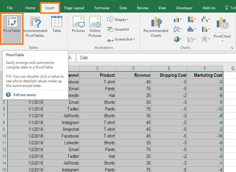
2. Insert the pivot table
In step two, you select the data you want to include in the table and then, on the Insert Tab on the Excel ribbon, locate the tables Group and select Pivot Table, as shown in the screenshot below.
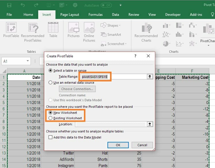
When the dialog box comes up, ensure the right data are selected and then decide if you want the table to be inserted as a new worksheet, or located somewhere on the current worksheet. This is entirely up to you and your personal preference.
3. Setup the pivot table fields
Once you’ve completed step two, the “PivotTable Fields” box will appear. This is where you set the fields by dragging and dropping the options that are listed as available fields. You can also use the tick boxes next to the fields to select the items you want to see in the table.
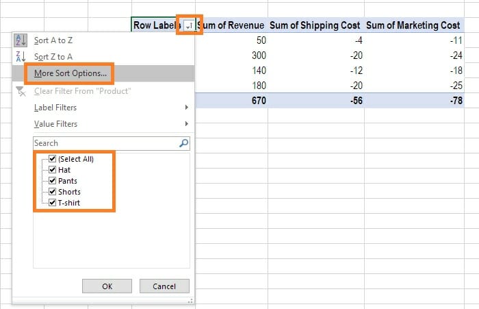
4. Sort the table
Now that the basic pivot table is in place, you can sort the information by multiple criteria, such as name, value, count, or other things.
To sort the date, click on the autosort button (highlighted in the image below) and then click “more sort options” to pick from the various criteria you can sort by.
Another option is to right-click anywhere in the table and then select Sort, and then “more sort options”.
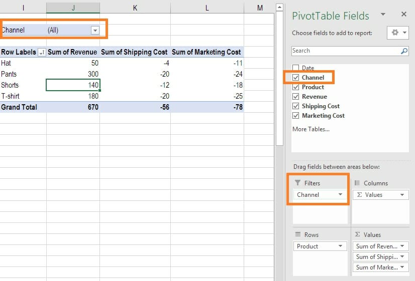
5. Filter the data
Adding a filter is a great way of sorting the data very easily. In the above example, we showed how to sort, but now with the filter function, we can see the data for specific sub-sections with the click of a button.
In the image below you can see how, by dragging the “channel” category from the list of options down to the Filters section, all of a sudden an extra box appears at the top of the pivot table that says “channel”, indicating the filter has been added.
Next, we can click on the filter button and select the filters we want to apply (as shown below).
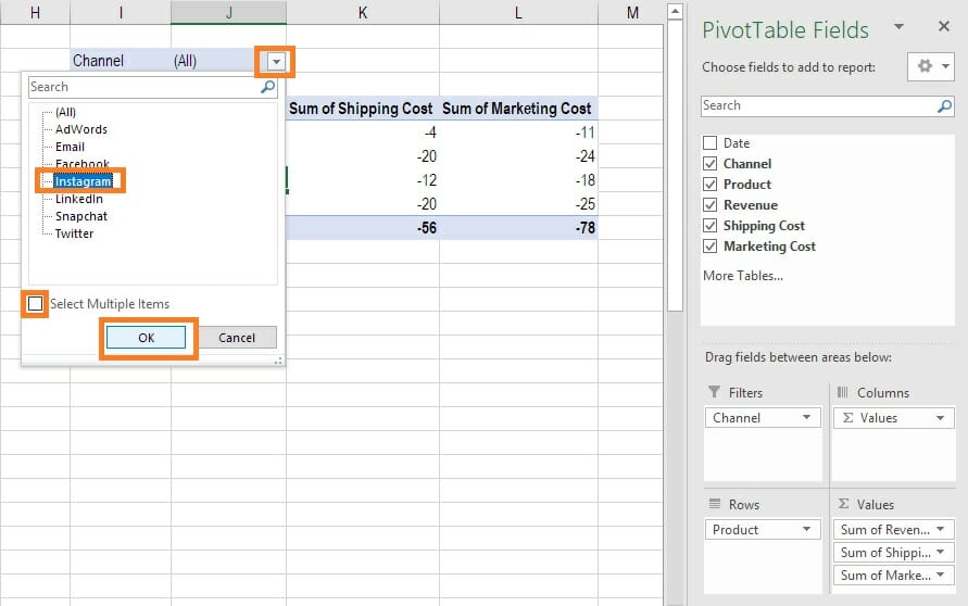
After this step is completed, we can see the revenue, shipping, and marketing spending for all products that were sold via the Instagram channel, for example.
More filters can be added to the pivot table as required.
6. Edit the data values (calculations)
The default in Excel pivot tables is that all data is shown as the sum of whatever is being displayed in the table. For example, in this table, we see the sum of all revenues by category, the sum of all shipping expenses by category, and the sum of all marketing expenses by category.
To change from showing the sum of all revenues to the “count” of all revenue we can determine how many items were sold. This may be useful for reporting purposes. To do this, right-click on the data you wish the change the value of and select “Value field settings” which will open the box you see in the screenshot below.
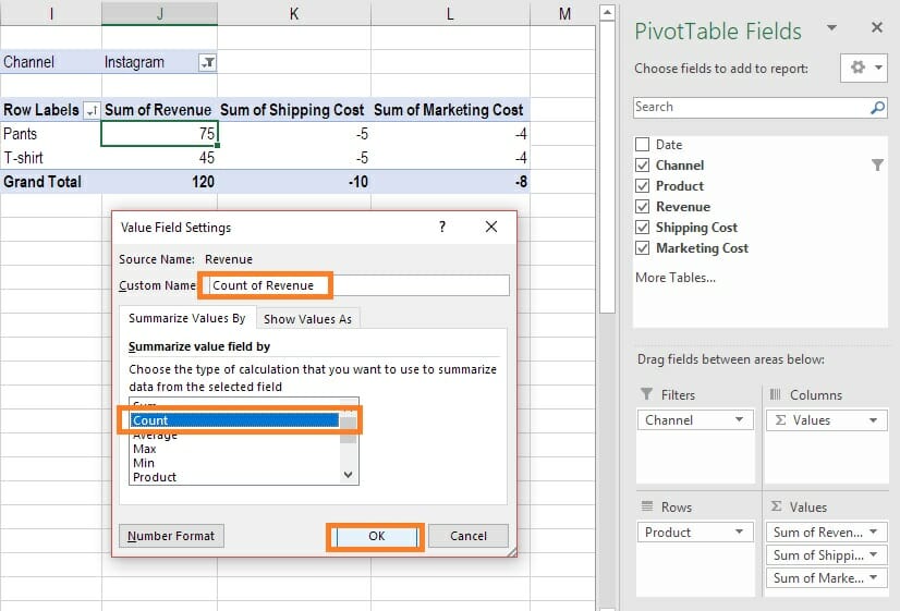
In accounting and financial analysis, this is a very important feature, as it’s often necessary to move back and forth between units/volume (the count function) and total cost or revenue (the sum function).
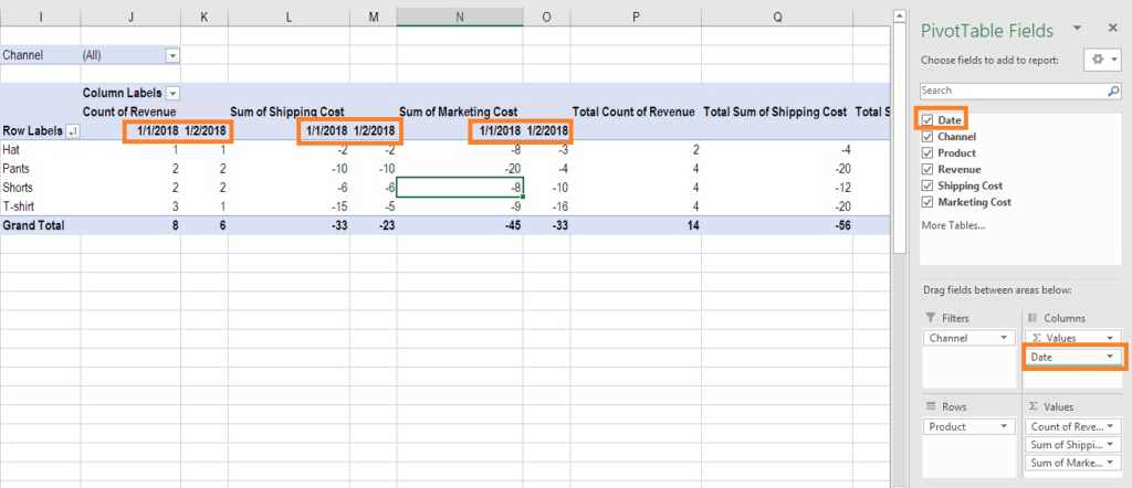
7. Adding an extra dimension to the pivot table
At this point, we only have one category in the rows and one in the columns (the values). It may be necessary, however, to add an extra dimension. A brief warning, however, that this could significantly increase the size of your table.
In order to do this, click on the table so that the “fields” box pops up and drag an extra category, such as “dates”, into the columns box. This will subdivide each column heading into additional columns for each date contained in the data set.
In the example below, you can see how the extra dates dimension has been added to the columns to provide much more data in the pivot table.